How to check what a release does to your pair
Every scheduled release has a track record. Non-Farm Payrolls has printed hundreds of times, and your pair has reacted to every one. News Impact Explorer turns that history into something you can read in a minute. This is not a signal to open in the last seconds before a release. It is the base rate you study ahead of time, so you have already decided how you will treat an event before it arrives. Here is how to read the tool, panel by panel, using NFP on XAUUSD as the worked example.
Start with the surprise, not the direction
Pick the event, the instrument, and a window along the top: US NFP, XAUUSD, 15 minutes. The tool sorts every past release into five surprise tiers, from big miss to big beat, because the thing that moves price is not that the release happened. It is how far the print landed from what the market had priced.
For this walkthrough, follow the big miss tier: jobs came in far below forecast. Weak US jobs usually means a weaker dollar, and a weaker dollar usually means gold up. That is the theory. Everything below is the tool showing you whether the history agrees.
The answer card: the headline and its caveat
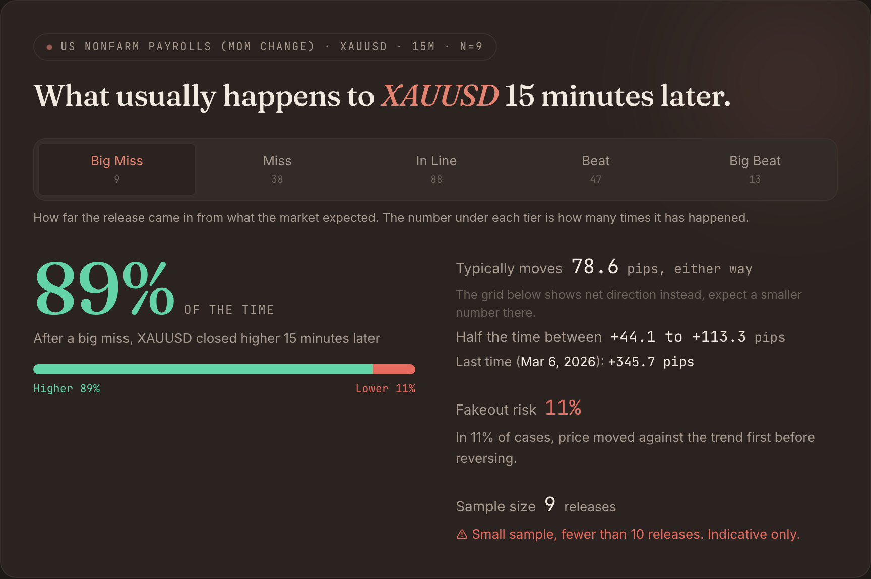
The card answers one question: what has usually happened to this pair, in this tier, in this window. After a big miss, XAUUSD closed higher 15 minutes later 89% of the time. It typically moved 78.6 pips either way, and half the time the move landed between +44.1 and +113.3 pips. Fakeout risk, how often price ran the other way first, was 11%.
Now read the line directly beneath it, because it is the reason to trust this over a screenshot from someone’s course. Sample size: 9 releases, flagged in coral as indicative only. A big miss is rare, so the tier is thin. Treat the 89% as a lean worth knowing, not a law to bet the account on. That flag is the tool doing your due diligence for you.
Read the grid across time
The card is one cell. The grid is every surprise tier against every window, so you can see whether a reaction builds, holds, or fades. Read one row left to right rather than staring at a single number.
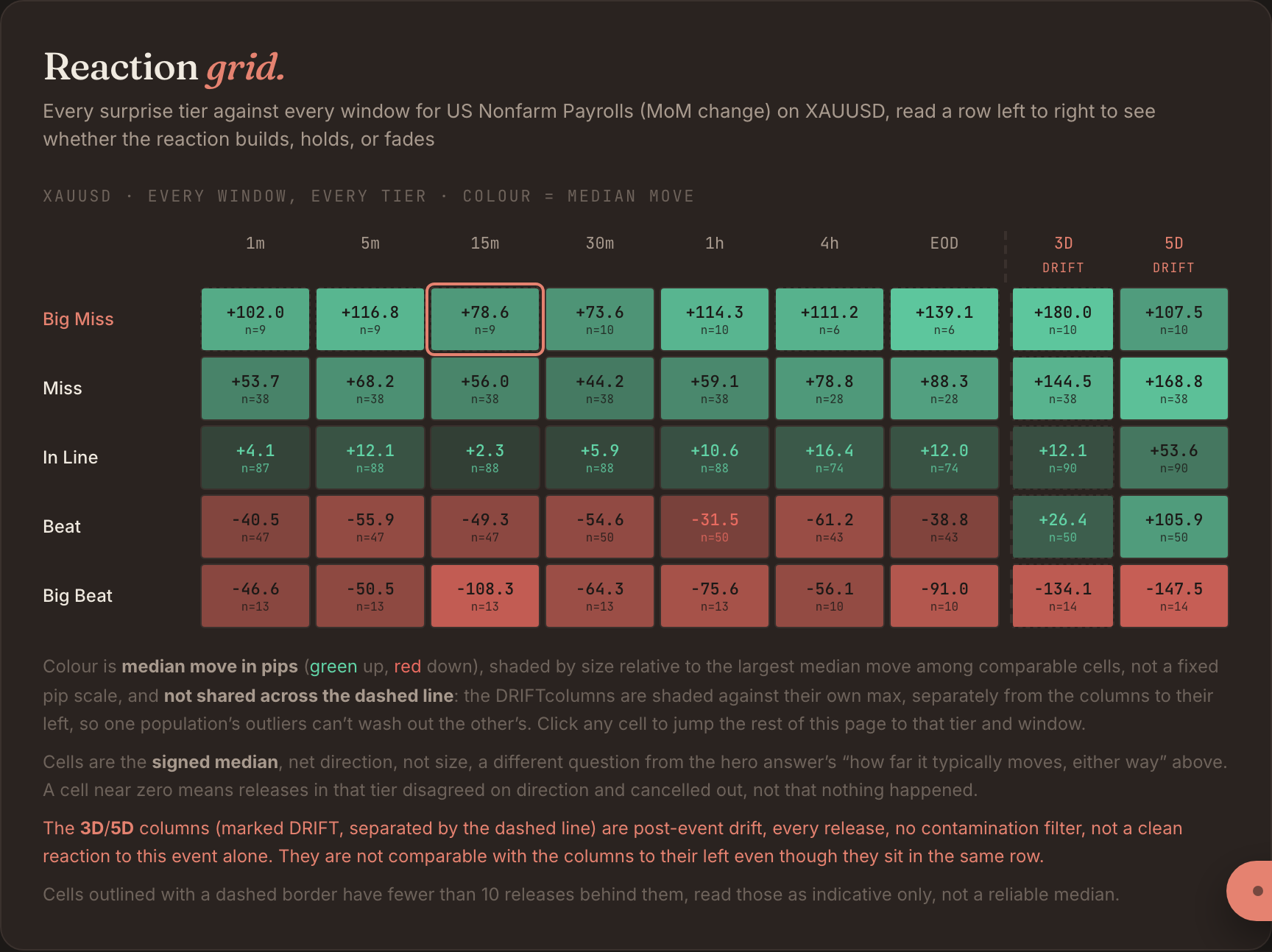
The big-miss row: +102 at one minute, +78.6 at 15 minutes, +114 at an hour, +139 by end of day. It builds through the session rather than fading, which tells you the historical edge on a big miss was an intraday hold, not a scalp closed in the first 15 minutes.
Two things keep the read honest. The beat rows below are red, gold falling on strong jobs, roughly the mirror image, which is what a real dollar story should look like. And the two rightmost columns are marked DRIFT and split off by a dashed line. Those are the 3 and 5 day windows with no contamination filter, so other events land inside them. They are not a clean read on this release alone, so read them last and lightly.
The spread, not just the median
A median hides the shape. “Typically 78.6 pips” could be nine near-identical moves or a pile of small ones with one outlier. The distribution panel shows every release, all five tiers together, at 15 minutes.
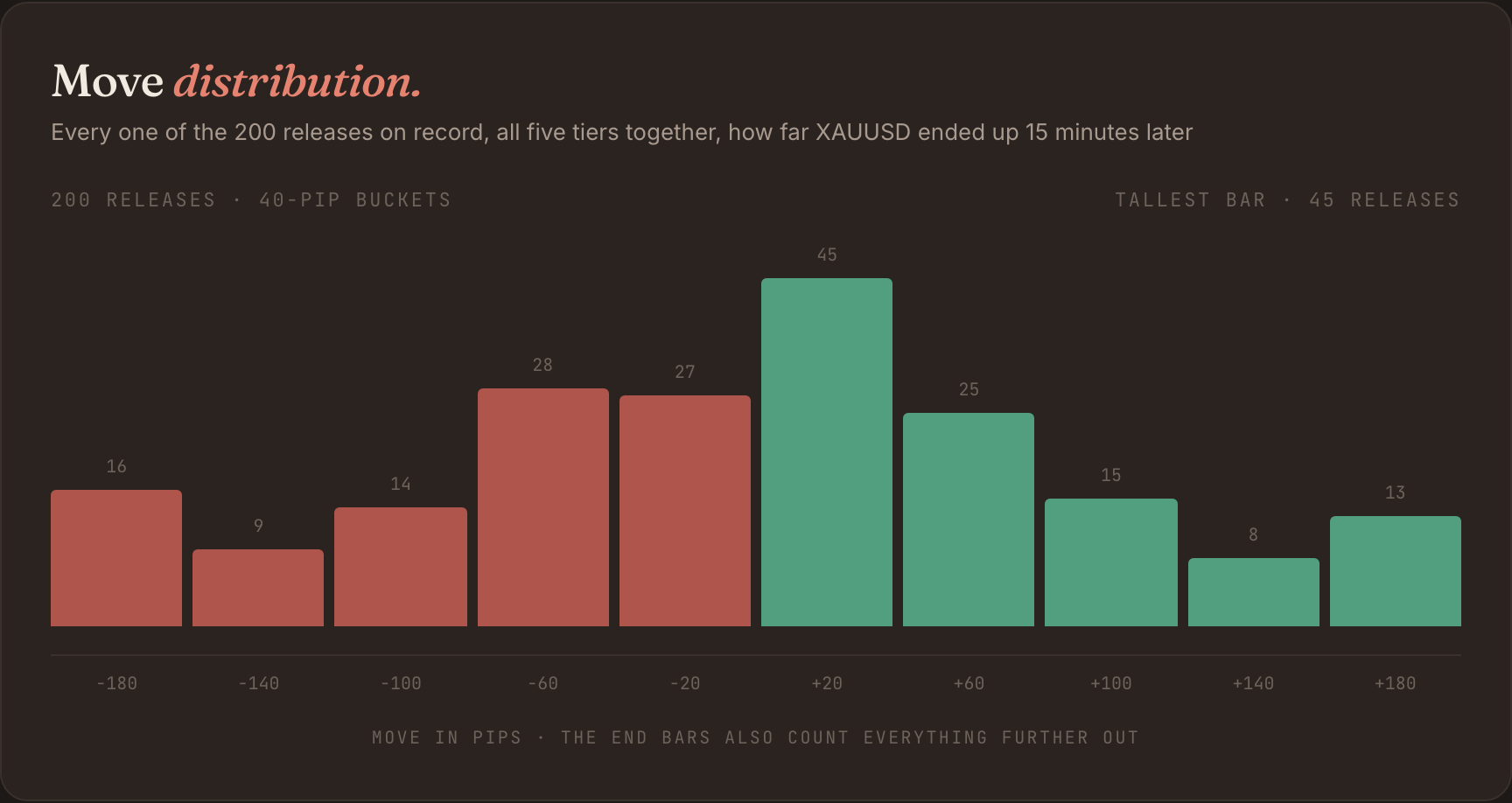
Across all 200 releases the mass sits just above zero, the tallest bucket is the +20 band with 45 releases, and the tail runs further right than left. Most NFP prints move gold a little; a few move it a lot. That is the risk profile you are actually taking, and no single median line would show it.
One pair, or the whole dollar?
One instrument can flatter a read. To tell whether a big-miss NFP is a gold story or a dollar story, check whether the move shows up across everything priced against the dollar. The pair panel ranks every instrument for the same event and tier.
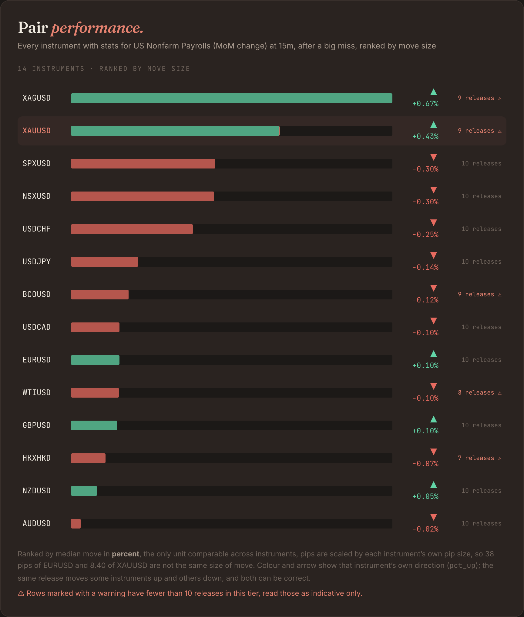
It is a dollar move. Silver leads at +0.67%, gold is second at +0.43%, and the US indices go the other way, the S&P around −0.30%. Metals up, the dollar and risk down, all from the same print. That agreement is what turns “gold went up” into “the dollar sold off,” and it tells you the gold read is not a one-instrument fluke. If gold’s own chart looks marginal, silver is where the same idea shows up larger.
See one real instance
The stats above are the base rate. The last panel shows one actual instance, so the number has a shape rather than staying abstract. This is the most recent big miss, 6 March 2026, minute by minute.
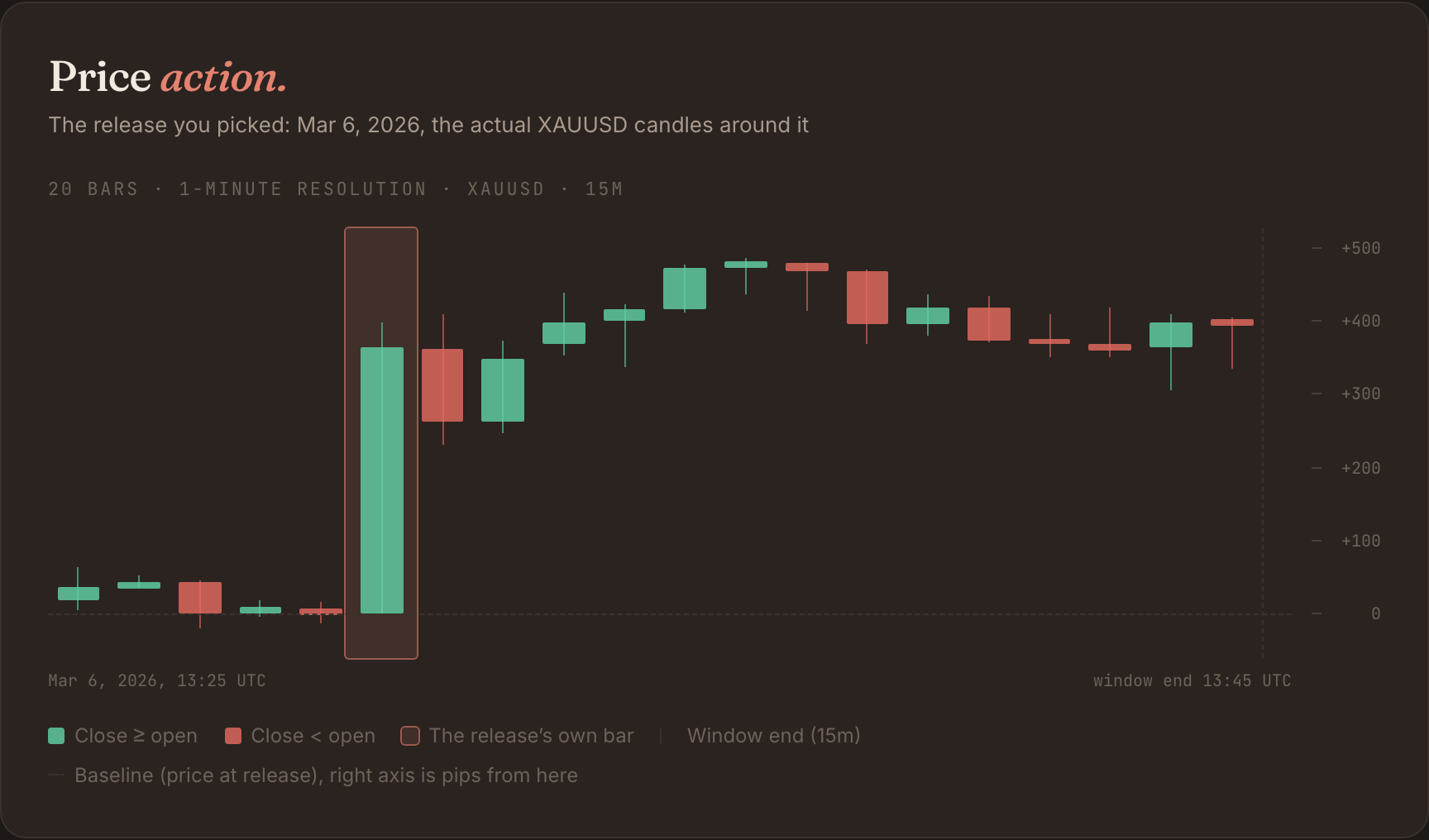
The release bar jumped +345.7 pips off the baseline in the first minute and held above +300 through the window. That is far bigger than the 78.6 typical move, which is exactly why you keep the median and the sample flag in view: one clean instance is the shape of the reaction, not the odds of it.
How to read it well
None of this predicts the next release. It shows you what your pair has done, how reliable that is, and whether the story holds up across instruments and windows, so you can decide how to treat an event ahead of time instead of in the heat of it. For the deeper question, whether these reactions drift on for days or mean-revert, there is a full breakdown of NFP across six windows.
Free, no signup. Read the same panels on your event: tryvantage.co/news-impact